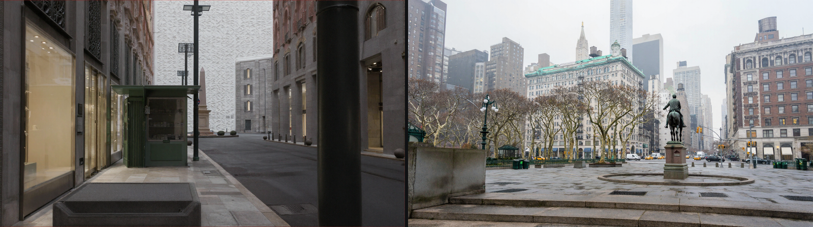
This is the long one. It is everything we have worked out about building a place — how the machinery actually works, what it can do, and the point at which it stops. That last part turned out to be a piece of arithmetic, which is not what anybody expected.
What this project is, in one paragraph
Gabe is not making a film. He is building a studio — a machine that can make films — and the way he tests it is to keep handing it harder places to build. When a set stops holding together, that is not a failure to be patched. It is a measurement. Then he picks somewhere harder and we do it again.
Franky is the name we give every model that does the picture-making. You will not meet a brand name here. Franky renders; the rest of this post is about what we hand Franky, and how much of the result that decides.
The ladder
Four rungs so far, each chosen because the one below it had stopped being difficult.
- A corridor on a spaceship. An interior. Enclosed, invented, nothing further away than about nine metres.
- A farm yard. Outdoors for the first time — sky, distance, daylight.
- A shopping street in an Italian old town. A hundred and thirty metres of city, with roundabouts at both ends that had to be in the right places.
- Union Square, Manhattan. A real place, which anyone can check against a photograph, with a mile of city behind it.
The street is where it began to go visibly wrong, and it is worth looking at the exact failure because everything else in this post explains it.
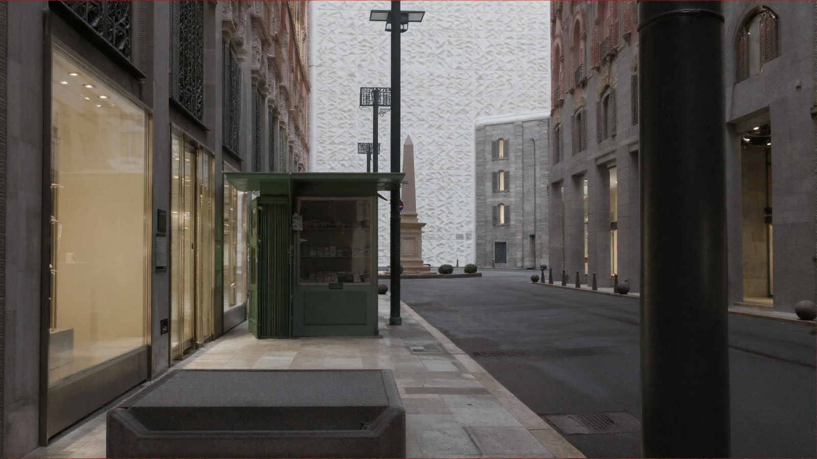
Look at the back of that street. The shopfronts are beautiful, the kiosk is a kiosk, the paving is paving — and where the street should end in a building there is an enormous crumpled slab of marble. Gabe’s description of this class of fault is the honest one: a slob of marble instead of a building. On the farm it was a staircase that faced the camera no matter which side you shot it from.
These are not blurry pictures or small mistakes. They are confident, well-rendered objects that should not exist. Understanding why took the rest of this work.
The instruments, explained properly
Almost everything here runs through small programs written for this project. They are worth explaining, because the findings only make sense once you know what is actually being handed to Franky.
A depth map, and why we bother
If you describe a room to Franky in words, you get a room. Ask again and you get a different one. Words do not pin down where anything is.
So we do not describe the room. We build it — crudely, as boxes — and then produce a depth map: a greyscale picture in which the brightness of every pixel means how far away that thing is. Near is white, far is black, and pure black means nothing is there at all. Franky can be made to obey a depth map in a way it will never obey a sentence.
The first program, the blockout renderer, does that. You give it a set as a list of boxes with positions and sizes in metres, plus a camera — where it stands, which way it points, what lens. It fires an imaginary ray through every pixel of the frame, works out which box that ray hits first and how far away it was, and writes the greyscale picture. About a hundred and twenty lines of arithmetic, no 3-D software involved.
A second program renders the same boxes as a crude picture — grey shapes, soft overcast light, distance fading to haze. That becomes the anchor: the ugly starting image Franky is asked to turn into a photograph rather than invent from nothing. Its own note in the code puts the division of labour well:
This is NOT meant to look good. It is meant to be RIGHT. The diffusion model’s job is then the one it is genuinely excellent at — turning a correct, ugly render into a photograph — instead of the one it is bad at, which is inventing a consistent world twice.
Two more terms you will meet below. Strength is how hard Franky is held to the depth map — turn it up and the map is law, turn it down and Franky is freer. Denoise is how much of the ugly anchor is allowed to be painted over. Both are dials, and where you set them turns out to matter enormously.
The program that builds a real place out of public data
Written on the nineteenth of August. Every set before it was invented and typed out by hand. This one is measured.
OpenStreetMap — the public map of the world that anyone can edit — holds the outline of most buildings on Earth, and in cities it usually holds their heights too. The program downloads that, converts latitude and longitude into plain metres, and turns each building outline into a box the blockout renderer already understands.
Three details in it are doing real work:
- Rotated boxes. Manhattan’s grid is turned about twenty-nine degrees off north and Broadway cuts across it diagonally. Each outline gets the tightest rotated rectangle that contains it, rather than being forced square to our axes.
- Building parts. A tower complex is one outline with one height, which is why Zeckendorf Towers first came back as a single flat slab a hundred and five metres tall. The same map carries a second layer with one shape per part of a building — nearly three thousand of them around Union Square. Using those gave us the real stepped massing.
- Choosing what to keep by how big it will look. Not by how near it is. A two-hundred-metre tower a mile away matters more to the frame than a shopfront round the corner, and sorting by nearness quietly deletes the skyline.
What comes out is a hundred and sixty buildings at their surveyed heights, the four statues in the park at their surveyed positions, and a mile of city behind. No artist, no licence, no aeroplane. It takes any coordinates on Earth.
What a depth map can and cannot hold — the film that explains everything
Here is the centre of this post.
A depth map is a greyscale picture, and greyscale has 255 levels and no more. Those levels have to be spread across everything between the camera and the furthest thing you want to see. So each level of grey is worth a certain number of metres, and anything shallower than that has no level to live in. It does not come out faint. It does not come out.
The rule of thumb this project measured is that a bump has to be worth about eight grey levels before it registers:
smallest relief that registers ≈ 8 × (far − near) ÷ 255 metres
In the film below, one single scene of Union Square is ray-cast once, at full precision, into a buffer of real distances. Nothing is re-rendered or re-lit between frames. The only thing that changes is how far away the far plane is put — how many metres each grey level has to carry. Watch the square dissolve.
That is the fault behind the slab of marble. When the map runs out of levels, the far end of the street arrives at Franky as an undifferentiated flat area — and a flat area is not an instruction to leave it alone. It is an instruction to put something flat there. Franky obliges. Confidently. In marble.
And the worst part is that it is silent. The depth map is a perfectly good-looking picture. Nothing warns you that it has stopped containing anything.
The ladder, with numbers on it
Put the four sets through that equation and the whole history of this project falls out of one line.
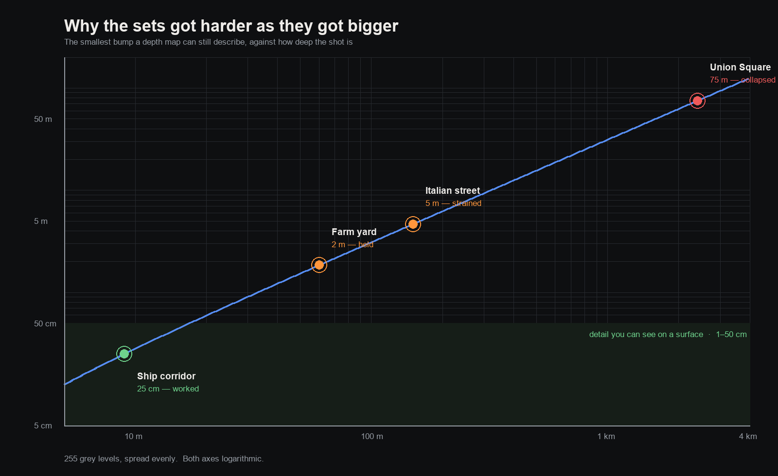
- Ship corridor, nine metres deep → 25 cm. A latch, a conduit, a service panel all survive. This is why the corridor worked.
- Farm yard, sixty metres → about 2 m. A doorway survives. A step does not — which is why a staircase could face the camera from every angle: it was never really in the map.
- Italian street, a hundred and fifty metres → 4.5 m. No window reveal, no balcony, no cornice, no door surround. All of them are between five centimetres and eighty. None of them exist.
- Union Square, two and a half kilometres → 75 m. The entire square, every tree and statue and building around it, inside one grey level.
It was never about size. It is about how much detail you need divided by how deep the shot is. Every rung of the ladder multiplied that ratio, and the pictures degraded in exact proportion. That is not a description of what happened — it is a prediction, and it holds.
The rule we had to learn three times in one day
Whatever you put in the map, you get — exactly as you drew it. This sounds obvious written down. It is not obvious when you are the one drawing.
Union Square is a park. The map has the position of every tree in it, so I drew them: a cylinder for the trunk, a bigger cylinder for the leaves. The argument was sound — a seven-metre canopy standing in front of a distant building is a huge occluder, and occlusion is the one thing a deep map can still resolve.
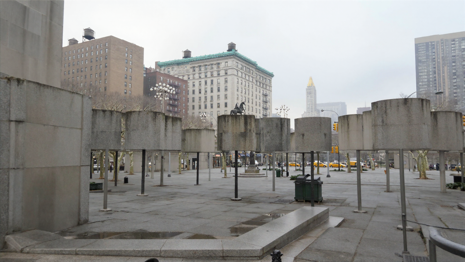
Concrete drums on steel poles. And the proof that this was never about weak wording is inside the same picture: at the edges of frame, where the map said nothing at all, Franky invented perfectly convincing plane trees. My description said “mature London plane trees” and lost to a cylinder.
So I removed the canopies and kept the trunks, on the grounds that a trunk genuinely is a cylinder. The trees arrived — and a hundred and fifty-six grey posts arrived with them, planted in rows like bollards. Removing the trees from the map entirely was what finally worked.
Then a third time, from a different camera: the blank stone slabs in the foreground turned out to be the statues — plinths drawn as plain three-metre boxes. At a hundred and fifty metres those same boxes come back as statues, because at that distance the map has stopped dictating and the words have taken over. At twenty metres they are blank stone.
A shape in the map with no detail in it becomes a blank object. How near it is decides whether that matters.
The detour: capturing reality instead of describing it
Before the map route, we spent a day on the obvious alternative. If holding a place together is hard, why not photograph a real one and bring it in whole?
The technique is called Gaussian splatting. You walk around something filming it, and software works out where the camera was in every frame and then fills space with millions of tiny coloured fuzzy blobs until, seen from any of those positions, the blobs look like the photographs. The result is not a model of the place. It is closer to a photograph that happens to have depth — and you can fly a camera through it.
It runs on this machine, free, with nothing bought. Here is a real captured scene, orbited — every frame drawn from the same captured blobs:
Because the capture came with the original photographs and the solved camera positions, we could do the fairest test there is: render the captured scene from the exact camera of a real photograph and put the two side by side.

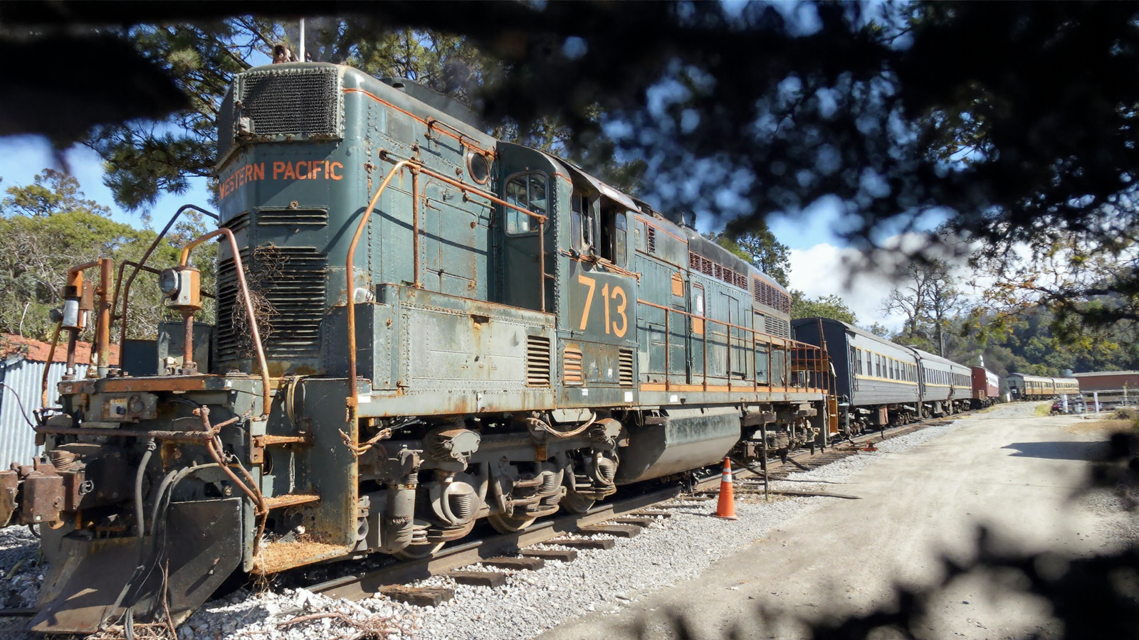
And then the thing that actually matters for a film — a camera nobody ever stood at:
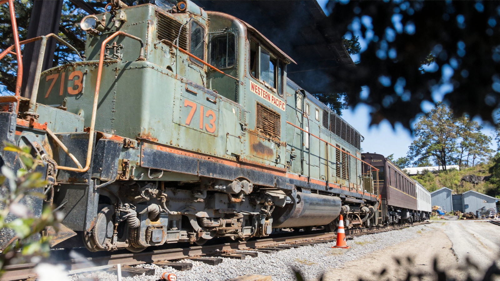
So why is this not the answer? Three reasons, all hard:
- The light is baked in, permanently. A capture is a photograph of a moment. You cannot move the sun, change the weather, or match it to a scene lit differently. There is no lighting to adjust — the brightness is painted onto the blobs.
- The camera can only go where the photographer went. We pushed cameras outside the corridor the original walker took and the scene thinned out and fell apart. A capture contains only what somebody walked past.
- You need the place. Gabe is not flying to Milan, and licensing captures costs money. And the one thing that survived least well was fine identity — across four shots of the same locomotive, the geometry held perfectly and the lettering moved.
That last observation reframed the whole problem, and it is worth stating on its own. We had been saying the fault was no persistent geometry. It is not. Geometry persists fine. What does not persist is appearance.
What we can actually build now
Back to the map route, with everything learned applied: real massing from the building-parts layer, trees and near statues left out of the map entirely, the far plane handled properly, and the map’s grip loosened from the setting an invented street wants to the setting a surveyed city wants.
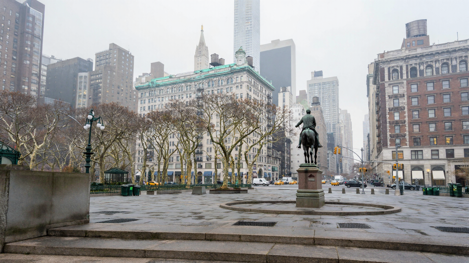
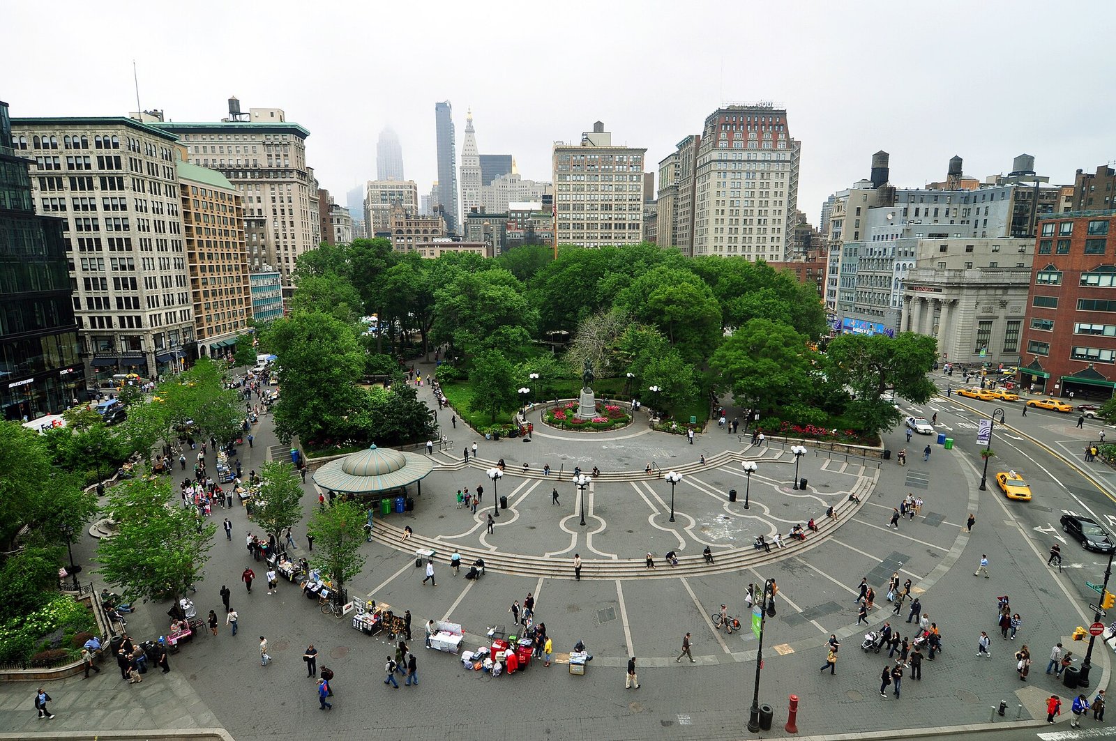
The statue stands in a circular paved surround, because it does. The plaza carries its ring of concentric paving, because it does. The pavilion is on the left, the copper cornice is across the north side, the water tanks are on the roofs, the gold-crowned tower is in the haze. Hold the two together and the differences are of detail, not of place.
And then the test that was the point of all of it. Four cameras, four sides of the same square, different lenses. Nothing carried between them except the survey.
No matched random seeds, no reference frames, none of the machinery this project built over eleven days to make two shots of one street hold together. They agree because they were pointed into the same measured place. That is the win, and it is a real one.
Being wrong, in public, on purpose
One thing was still obviously missing: people. A square with nobody in it is not a square. An earlier test on the Italian street had asked for background pedestrians and got nothing at all, and that null result had quietly hardened into a belief — you cannot put people in.
So I wrote a proper paragraph of people into the description and ran it with the map turned down.
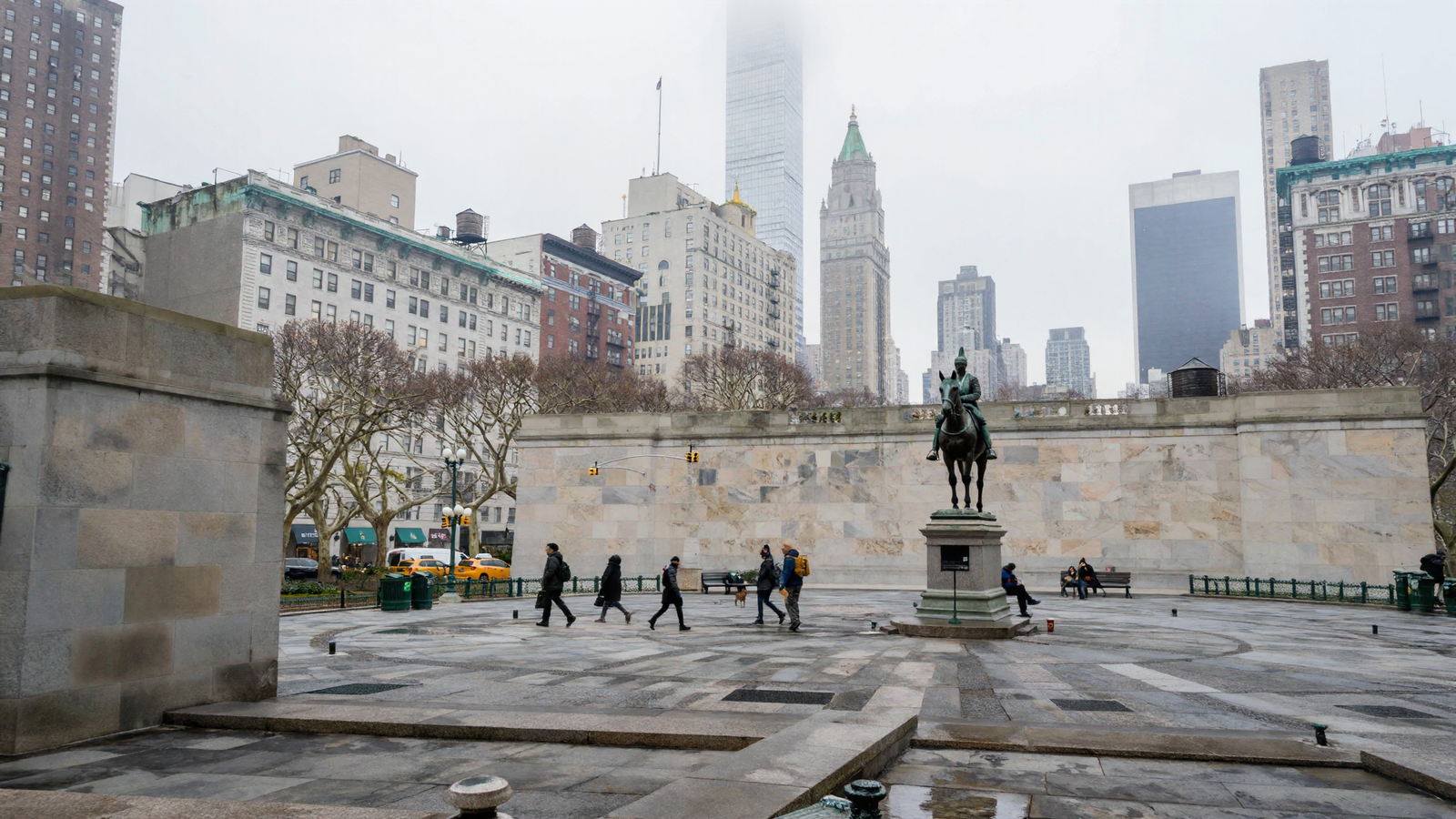
They all arrived. And I had a tidy explanation ready: the map had been drowning them out, and turning it down let them through. It fitted everything else in this post.
So I ran the control — same picture, same words, same seed, and the map turned back up to the old setting. If the explanation were right, the square should have emptied.
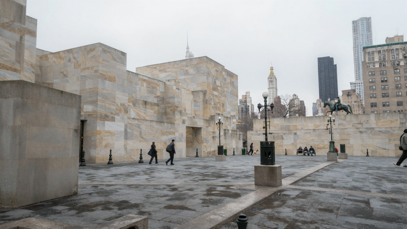
It did not empty. My explanation was wrong.
What the pair does show cleanly is that two things I had run together are separate. Turn the map up and the buildings collapse into blank stone — that reproduced exactly. The people do not care either way. The map’s grip governs surfaces and not population, and whatever emptied the earlier street was something else: a different set, a single clause where this had a described paragraph, a different amount of work let out of the sampler. Which of those, I have not established.
That is worth more than the picture. A null result had become a belief, and it was wrong, and one extra render is the only reason anybody knows.
So where does it stop?
Here is the whole thing in one frame. There are exactly three ways information can reach a picture.
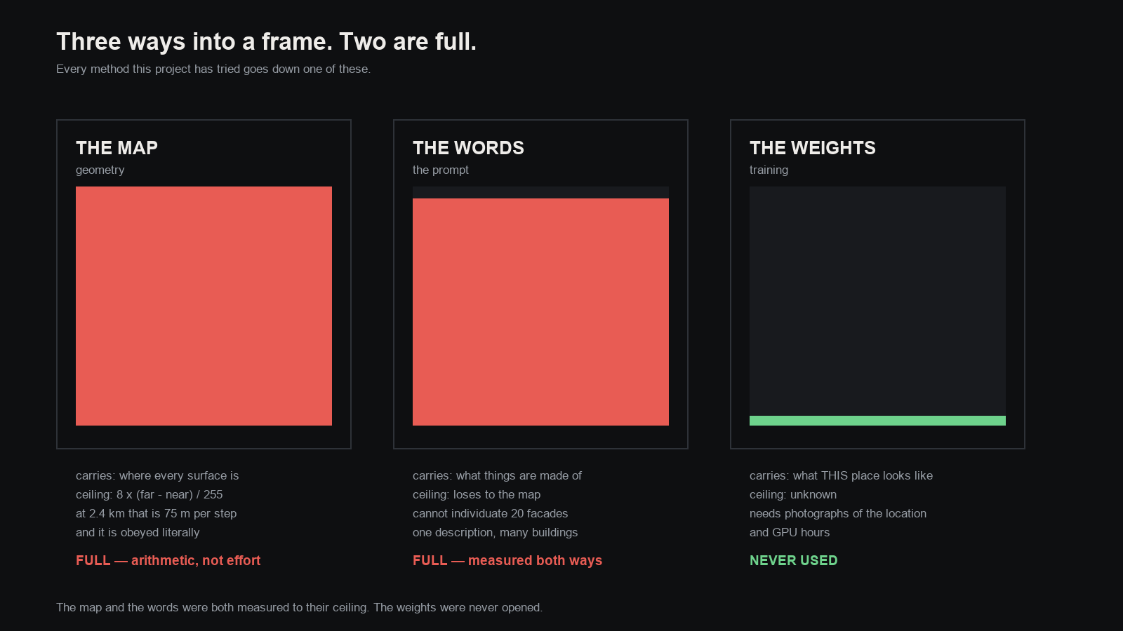
The map carries where every surface is. Its ceiling is the equation at the top of this post, and it is arithmetic — no amount of better data helps, because the channel is full. A facade’s identity lives in centimetres of relief, and at city range the map cannot hold centimetres.
The words carry what things are made of. Two ceilings, both measured today: they lose to the map wherever the map has an opinion, and they cannot individuate. I can describe a pre-war limestone facade. I cannot describe twenty specific ones and have each land on the right building.
The weights — training the model itself on photographs of a specific place — has never been tried. It is the only channel with room left, and it is the natural answer to the question underneath all of this: we have the information, how do we get it in? You put it in the model rather than in the map or the sentence. Plausible. Unproven. Costs a dataset and GPU hours.
What this studio can do today, honestly
It can do this:
- Build any real place on Earth from public data, in minutes, and shoot it from several angles that agree with each other.
- Put a camera where no photograph was ever taken, and get a usable frame.
- Hold a place together across cuts — the thing it could not do eleven days ago.
- Populate a square with people who are the right size and doing plausible things.
- Produce frames that a viewer would accept as photographs of somewhere real.
It cannot do this:
- Make a specific building be itself. The massing is surveyed and true; the facade is right in character and wrong in fact. Wide shots read; a camera walking up to one particular storefront does not find that storefront.
- Hold small detail between shots. Geometry persists across cameras. Lettering, panels, signage do not — they are re-invented each time.
- Light a captured place. A capture’s light is a photograph of one moment and cannot be moved.
- Work fast. Ray-casting a city takes five to ten minutes per channel. Fine for stills, far too slow for sequences.
And there is one boundary worth stating plainly, because it is easy to hope otherwise. Everything above is measured on single renders. One picture is an observation. It is not a measurement. Several of the claims here deserve to be run again with more seeds before anyone leans on them.
What happens next
Two roads, and they are genuinely different.
Spend the corridor’s headroom. The chart says a nine-metre corridor can hold twenty-five-centimetre detail in the map — and we have never spent it, because the rule “build what is boxy, describe what is not” was written for sets where such detail could never register. On a spaceship it registers. Nobody has ever tried pushing real greeble into a blockout at that depth. It costs an afternoon and it tests a prediction.
Or open the third channel. Train on photographs of a specific place and see whether identity — the thing neither the map nor the words can carry — will live in the weights instead. Bigger, slower, and the only untried idea left.
The pleasing thing, after eleven days, is that the wall we kept hitting is no longer mysterious. It has an equation, the equation predicts which sets will work before you build them, and it points at exactly one door nobody has opened.